Blog Task - Piet Mondrian
Monday, July 30, 2012♥
8:19 AM
Piet Mondrian
De Stijl
 |
| Avond (evening) Red Tree, 1908 |
Description
The image depicts a lone tree right in the center of the painting. The tree is formed by large visible brushstrokes with intricately interlaced branches without leaves. Mondrian uses arbitrary colours to create contrast. While the painting is dominantly blue, the bottom ends of the tree is littered with specks of red/orange which makes the picture more interesting
Analysis
As seen from the brushstrokes and choice of colour, we can see some influences from the Fauvist movement as well as the Post-Impressionist Movement. The rough and choppy brushstrokes here indicate a sense of motion of the tree. the composition is also imbalanced, being heavier towards the right side.
Interpretation
As the only subject matter of the painting, the tree emits a sense of lonely solitude. As there are no leaves, it suggests the notion of death and decay. Though there is a faint horizon, there seems to be nothing beyond. It seems to be left unfinished to expose the raw emotions behind the painting. It is also slightly ironic how the painting is dominantly blue while the subject matter is supposed to be a red tree. The only hint of it is the bark and certain parts of the tree which is highlighted with red. This could show how the colour and life of the tree is being sapped.
Judgement
Mondrian is successful in portraying the sense of loneliness and bleak atmosphere of the tree. He strategically placed a single tree right in the center to allow viewers to focus their attention on it and notice the lack of other subject matter surrounding it to create a sense of solitude. The colour blue is an emotive colour for melancholy and it surrounds the entire painting, cloaking it with its solemn atmosphere.
 |
| Grey Tree, 1911 |
Description
Similarly to the work above Mondrian has yet again painted a lone tree. This tree is placed in a more balanced composition, almost being symmetrical. The branches are stark and contrasts with the light grey background. Thick brushstrokes are used and is applied in a painterly manner where viewers can see the individual strokes. The background is comprised with several shades of grey which resembles blocks of colour.
Analysis
The tree branches are drawn across in thick curves which are significantly more stylised than in the previous work, it seems to have been painted on in sweeping motions across the canvas as indicated by the curved branches. The brushstrokes too, are also much thicker and are applied differently. It is choppier, and seems to be applied hastier. The subject matter looks more abstract than in the Red Tree. The painting is brought to life by the dynamism of the different shades of grey in the background, having a slight vignette effect with the core of the painting having the lightest grey.
Interpretation
Contrary to the Red Tree, the Grey Tree, though with a much more solemn title appears to be much more vibrant in spite of its lack of colour. As the dark grey/black branches are a stark contrast to the much lighter grey background, the tree stands out much more. It appears to be a scene of a tree in winter. Though it has no leaves, it does not look as bleak as it did. As the painting looks crowded with branches, it does not look lonely or melancholic, instead, it seems to be pridefully showing off its majestic branches even without its leaves.
Judgement
If the artist was trying to portray a sad, solemn painting of the Grey Tree, I would think that he was not successful as it offers a more domineering and majestic approach towards the leafless tree. However if that was not his aim, he would then be successful. A single leafless tree is conventionally thought to suggest sadness, loneliness and decay, yet in this painting, it does not seem so lifeless and in fact, goes against that notion.
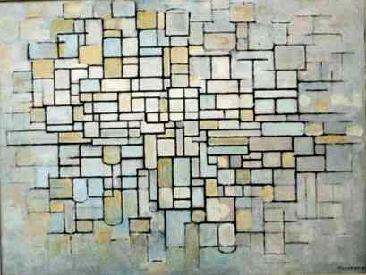 |
| Composition no.ii (Composition in Line and Colour), 1913 |
Description
This work depicts blocks of squares and rectangles packed together. The various blocks are of a slightly muted pastel colours put together. They are delineated by bold black outlines which intersect each other in a systemic grid-like network.
Analysis
As with the title suggests, the painting is fundamentally formed with only lines and colour. Though the image is flat, the colours are not of solid blocks, they appear to be splotched and patchy throughout. The lines of the painting are bolder and darker in the center of the painting and it eventually fades out, creating an impression of infinity as it looks like it may never end. The painting style here greatly differs from that of his past works as it no longer shows recognisable forms of subject matter, instead it is only mere lines and colour. This could show his interest towards geometric shapes and abstraction.
Interpretation
From what I see, the image looks like a brick wall comprised of bricks of different shapes, sizes and colour. Yet it is a mere abstract piece of work. The tones and hues of this work are pastel, evoking a sense of peace and serenity in viewers. With the darker and more concentrated core of the painting, it shows how Mondrian has a liking for vignette effects as evidently shown in this work and the previous one.
Judgement
This work is successful in emitting a sense of serenity with the use of colours. The rigidity and boldness of the lines also serve to draw the viewer's attention as each stroke is in a straight line properly drawn to define each individual shape to enhance the neatness and geometric effect he had wished to achieve.
 |
| Composition with large blue plane, red, black yellow and grey, 1921 |
Description
This work seems to be a further stylised and highly abstracted version of Composition no.ii
There is only grey, yellow, blue, red and black in this painting at seemingly random areas of the canvas. They are yet again delineated with thicker, bolder black outlines into rectangle that together form the canvas.
Analysis
As opposed to the painterly manner he adopted in his previous works, this one seems to have been done in modern technology today with shape tools and outlines. However this was done in 1921, when clearly there was no such technology. Mondrian may have had a foresight towards modern art. The painting has a greatly asymmetrical composition with a great patch of blue on the top right hand corner of it.
Interpretation
This work can be seen as a sort of experimentation on Mondrian's part as the title implies that there are many other compositions. This painting seems to echo abstract expressionism in terms of colour field painting and the geometrical abstract approach towards art. Only, this work provokes a different set of notion towards art.
Judgment
Mondrian is highly successful in this artwork as such a concept is definitely fresh and unseen from any other past movements. In fact, it has brought the mild abstraction and geometric-ism to a higher level. Furthermore, back in 1921, this work would have impacted the people much greatly than it would now.
 |
| Red and Blue Chair, Gerrit Rietveld, 1917 |
Mondrian's works are parked under a greater umbrella called the De Stijl movement. Another such artist is Gerrit Rietveld, with one of his works as shown above. Clearly, the overarching themes of the De Stijl movements include the geometrical shapes and straight black outlines, along with the use of primary colours. While such a chair design would be more accepted in current context, we have to remember that such a work was produced in 1917, where most furniture would probably would have been grander and formed by curved lines.
Clearly, such aspects of design has been a great impact and inspiration towards modern art and graphical design, creating a lasting impression. Even now, there are artists and design concepts which makes use of pure straight lines and geometric shapes in vivid colours to create a dynamic visual effect as Mondrian had done.
Below is a work which I've worked with my dear friends - Beilin, Rachel and Jubilee on :D
It is an emulation of Piet Mondrian's work using his noted characteristics of having bold geometrical shapes. However we felt that it'd be better if we added a black outline around it!
Comment! (:


