Blog Task - Piet Mondrian
Monday, July 30, 2012♥
8:19 AM
Piet Mondrian
De Stijl
 |
| Avond (evening) Red Tree, 1908 |
Description
The image depicts a lone tree right in the center of the painting. The tree is formed by large visible brushstrokes with intricately interlaced branches without leaves. Mondrian uses arbitrary colours to create contrast. While the painting is dominantly blue, the bottom ends of the tree is littered with specks of red/orange which makes the picture more interesting
Analysis
As seen from the brushstrokes and choice of colour, we can see some influences from the Fauvist movement as well as the Post-Impressionist Movement. The rough and choppy brushstrokes here indicate a sense of motion of the tree. the composition is also imbalanced, being heavier towards the right side.
Interpretation
As the only subject matter of the painting, the tree emits a sense of lonely solitude. As there are no leaves, it suggests the notion of death and decay. Though there is a faint horizon, there seems to be nothing beyond. It seems to be left unfinished to expose the raw emotions behind the painting. It is also slightly ironic how the painting is dominantly blue while the subject matter is supposed to be a red tree. The only hint of it is the bark and certain parts of the tree which is highlighted with red. This could show how the colour and life of the tree is being sapped.
Judgement
Mondrian is successful in portraying the sense of loneliness and bleak atmosphere of the tree. He strategically placed a single tree right in the center to allow viewers to focus their attention on it and notice the lack of other subject matter surrounding it to create a sense of solitude. The colour blue is an emotive colour for melancholy and it surrounds the entire painting, cloaking it with its solemn atmosphere.
 |
| Grey Tree, 1911 |
Description
Similarly to the work above Mondrian has yet again painted a lone tree. This tree is placed in a more balanced composition, almost being symmetrical. The branches are stark and contrasts with the light grey background. Thick brushstrokes are used and is applied in a painterly manner where viewers can see the individual strokes. The background is comprised with several shades of grey which resembles blocks of colour.
Analysis
The tree branches are drawn across in thick curves which are significantly more stylised than in the previous work, it seems to have been painted on in sweeping motions across the canvas as indicated by the curved branches. The brushstrokes too, are also much thicker and are applied differently. It is choppier, and seems to be applied hastier. The subject matter looks more abstract than in the Red Tree. The painting is brought to life by the dynamism of the different shades of grey in the background, having a slight vignette effect with the core of the painting having the lightest grey.
Interpretation
Contrary to the Red Tree, the Grey Tree, though with a much more solemn title appears to be much more vibrant in spite of its lack of colour. As the dark grey/black branches are a stark contrast to the much lighter grey background, the tree stands out much more. It appears to be a scene of a tree in winter. Though it has no leaves, it does not look as bleak as it did. As the painting looks crowded with branches, it does not look lonely or melancholic, instead, it seems to be pridefully showing off its majestic branches even without its leaves.
Judgement
If the artist was trying to portray a sad, solemn painting of the Grey Tree, I would think that he was not successful as it offers a more domineering and majestic approach towards the leafless tree. However if that was not his aim, he would then be successful. A single leafless tree is conventionally thought to suggest sadness, loneliness and decay, yet in this painting, it does not seem so lifeless and in fact, goes against that notion.
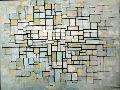 |
| Composition no.ii (Composition in Line and Colour), 1913 |
Description
This work depicts blocks of squares and rectangles packed together. The various blocks are of a slightly muted pastel colours put together. They are delineated by bold black outlines which intersect each other in a systemic grid-like network.
Analysis
As with the title suggests, the painting is fundamentally formed with only lines and colour. Though the image is flat, the colours are not of solid blocks, they appear to be splotched and patchy throughout. The lines of the painting are bolder and darker in the center of the painting and it eventually fades out, creating an impression of infinity as it looks like it may never end. The painting style here greatly differs from that of his past works as it no longer shows recognisable forms of subject matter, instead it is only mere lines and colour. This could show his interest towards geometric shapes and abstraction.
Interpretation
From what I see, the image looks like a brick wall comprised of bricks of different shapes, sizes and colour. Yet it is a mere abstract piece of work. The tones and hues of this work are pastel, evoking a sense of peace and serenity in viewers. With the darker and more concentrated core of the painting, it shows how Mondrian has a liking for vignette effects as evidently shown in this work and the previous one.
Judgement
This work is successful in emitting a sense of serenity with the use of colours. The rigidity and boldness of the lines also serve to draw the viewer's attention as each stroke is in a straight line properly drawn to define each individual shape to enhance the neatness and geometric effect he had wished to achieve.
 |
| Composition with large blue plane, red, black yellow and grey, 1921 |
Description
This work seems to be a further stylised and highly abstracted version of Composition no.ii
There is only grey, yellow, blue, red and black in this painting at seemingly random areas of the canvas. They are yet again delineated with thicker, bolder black outlines into rectangle that together form the canvas.
Analysis
As opposed to the painterly manner he adopted in his previous works, this one seems to have been done in modern technology today with shape tools and outlines. However this was done in 1921, when clearly there was no such technology. Mondrian may have had a foresight towards modern art. The painting has a greatly asymmetrical composition with a great patch of blue on the top right hand corner of it.
Interpretation
This work can be seen as a sort of experimentation on Mondrian's part as the title implies that there are many other compositions. This painting seems to echo abstract expressionism in terms of colour field painting and the geometrical abstract approach towards art. Only, this work provokes a different set of notion towards art.
Judgment
Mondrian is highly successful in this artwork as such a concept is definitely fresh and unseen from any other past movements. In fact, it has brought the mild abstraction and geometric-ism to a higher level. Furthermore, back in 1921, this work would have impacted the people much greatly than it would now.
 |
| Red and Blue Chair, Gerrit Rietveld, 1917 |
Mondrian's works are parked under a greater umbrella called the De Stijl movement. Another such artist is Gerrit Rietveld, with one of his works as shown above. Clearly, the overarching themes of the De Stijl movements include the geometrical shapes and straight black outlines, along with the use of primary colours. While such a chair design would be more accepted in current context, we have to remember that such a work was produced in 1917, where most furniture would probably would have been grander and formed by curved lines.
Clearly, such aspects of design has been a great impact and inspiration towards modern art and graphical design, creating a lasting impression. Even now, there are artists and design concepts which makes use of pure straight lines and geometric shapes in vivid colours to create a dynamic visual effect as Mondrian had done.
Below is a work which I've worked with my dear friends - Beilin, Rachel and Jubilee on :D
It is an emulation of Piet Mondrian's work using his noted characteristics of having bold geometrical shapes. However we felt that it'd be better if we added a black outline around it!
Comment! (:
Blog Task - Les Valeurs Personelles (Personal Values), by Rene Magritte
Friday, July 20, 2012♥
11:20 PM
.jpg) |
| Personal Values, Rene Magritte, 1952, Belgium. |
Everyone has their own set of values; things which we prioritise, items we hold close to our hearts. In this work 'Personal values', Magritte has depicted his own set of personal values in the form of a surrealist painting as seen above.
Description
In this painting, Magritte illustrates a scene of a bedroom.
The work is in predominantly cool colours due to the wallpaper of skies and clouds. At first sight, the bedroom looks mundane with the typical wooden bed and cupboard each at the left and right side of the room respectively. The cupboard however has a mirror that reflects a small window at the other end of the room not visible to us from this perspective.
What would capture the viewer's attention to the strangeness of this painting is the size of the various objects lying around the room. there is an oversized brown comb resting on the bed with its tip almost in contact with the ceiling. There is a blusher/shaving brush that can be found on the wardrobe. There is also a round bar of soap the size of a coffee table in front of the wardrobe. In the middle of the room, there is a translucent turqoise wine glass. It's height is unrealistically as tall as the wardrobe and it has a abnormally large match stick right next to it where it is situated next to the bed.
As a whole this work shows us a mundane scene of a bedroom, made interesting by the unusual sizes of the various everyday objects lying around seemingly random around the room, in a balanced composition.
Analysis
The painting has a photorealistic quality. All the details in the painting seem to have been painted on meticulously with brushstrokes so fine that we can barely see its traces. The details, patterns and prints seem to have been painted in utmost precision. Such could have been done to further emphasize how normal and realistic every is, yet shocking the viewers by blowing up the various objects, creating a sense of doubt to the viewer whether the objects are just extraordinarily huge or if the bedroom itself is in fact in a minute scale.
Furthermore, contrary to what other surrealists painter does, such as Dali, he does not involve himself in fantasies, rather he makes use of manipulation of scale of objects to create the dream-like and unusual effect that deems the work surreal.
Interpretation
The wallpapers of clouds and sky could possibly be an ironic element in this painting. While the room is bounded by the four sides of the wall, the wallpaper creates an illusion such that creates a sense of space, as if the room is suspended in the sky, representing freedom. This could be symbolic of our own mindsets and values. While we may believe that we can have any sorts of values that we can deem ours, they are always bounded by an inconspicuous boundary that we may be unaware of, yet we do not cross it.
The scene of the bedroom itself is symbolic of own's inner state of mind. In the tangible world, the only place where we probably feel the safest, with the greatest sense of belonging and identity is probably our own bedroom.
Magritte has made use of each of the objects to represent his own personal values.
Comb:
This probably represents how he prioritises the need to be kept neat and presentable to public eyes. It is also a comment on middle class life and conventionality.
Soap:
This would undoubtedly symbolise personal hygiene as a part of his personal values.
Match Stick:
Being next to the bed, it involves a French pun which hints at sexual desires.
Wine Glass:
Could possibly refer to alcoholic pleasure
Judgement
In trying to portray his own set of personal values in his work, I feel that Magritte had done a successful job in bringing this across. The items he had picked were symbolic and easy to relate to its meaning due to the realistic representation. Furthermore, he had scaled up the various objects as if it was in direct proportion towards how much he values it. Apart from this reason, the scaled up objects also serve as a subject of attention for viewers as they would be hooked on to the painting at first by the oddness of the painting. Only then would they pay sufficient attention to decipher the various symbols and make sense out of the work, which deems the work successful in relaying its message.
 |
| My Personal Values |
In response to Magritte's work, I went on to explore my own personal values and eventually came up with a sketchy sketch as shown above. Admittedly, it lacks Magritte's professionalism in form and painting..
Nevertheless, this depicts some of the items I find that is core in my own set of Personal Values.
Bed
Sleep. The bed represents the need for rest and relaxation which I personally find essential to our lives. If we never stop working, to let ourselves recover, it then has adverse impacts on what we strive to achieve.
Watch
This is a watch I have worn for nearly four years now. The watch naturally represents time. While time is intangible, I had used a watch to symbolise its importance to my life. Life is hectic sometimes, there are simply too little time for the many things we have to accomplish out of responsibility and desire. Life, is actually rather short. Hence time ought to be treasured and valued.
Key
My house key symbolises a sense of belonging and home which everyone should deserve and need for a place to belong in. Also, it represents my sense of security.
Spectacles
As someone who has short-sightedness, I can never leave my spectacles for long. While I can still technically see what is around me, reading minute letters are beyond me. Without my spectacles,I won't be able to read, draw or see things in detail. The thought of losing that can be frightening. It is just how much I value my sight.
Wooden Drawing Model/Pencil
The Wooden Drawing Model and Pencil both represents my passion towards art. While the Drawing Model tells of my preference in figure drawing/drawing of humans, the pencil is there in place of even a paint brush because it was the first tool I had picked up for art making.
Hanging Dress
Needless to say, the hanging dress symbolises my passion towards fashion and perhaps hints at my vanity. It also shows the import I place on being well dressed and presentable, in a fashionable manner. It is purposefully placed near the Wooden drawing model and pencil to show how closely I place art and fashion, I see fashion as art and art can be made into fashion.
Mirror
While this could be a prime indicator of my feminine vanity, this mirror is mostly to represent my value on reflection. Often, I see a need to reflect back on my past actions and the mirror can also be a form of mimic, where this part of me may subconsciously mimic another....
With that, my seven 'values' had been haphazardly strewn across the room aside from those purposefully placed as mentioned. This itself reflects my not-so-tidy nature, where I see beauty in disorder.
Labels: Blog Task
0 comments
Comment! (:
Blog Task - Reptiles, Mc Escher
Friday, July 13, 2012♥
7:18 PM
Art. It's subject matter are mere figments of an artist's creation. More often that not, in penning our visions down on paper, we are bringing our creations to life. However, donning them on mere paper is only 2-dimensional. It is not exactly alive.
Now, imagine you've left your half finished artwork on your desk top, and you've walked away. Ever wondered how it'd be like if our artworks come to life? The seemingly flat dimension on the paper could emerge out, such that it now has a 3 dimensional form, a tangible reality.
That is probably what Mc Escher was trying to portray in his work as shown below.
 |
| Escher, MC. "Reptiles". Lithograph. 1943. |
In the lithography by Escher, it depicts a opened up sketchbook, with a half drawn page featuring his abstract tessellation of reptiles. The surroundings are scattered with miscellaneous objects such as plants, books, bottle, cups and a polygonal 3-D object. From the illustrated tessellation in the sketchbook, the reptiles seem to gradually materialise into its form from the bottom left hand corner of the illustration. One by one, it seemingly emerges from the illustration and climbs upon the other objects around, going in a cyclical motion. The reptiles then eventually crawl over the book, the cup and the polygonal object in a circle, back into the illustration where the reptile is once again gradually integrated back into it's 2-Dimension form.
The lithography is completely black and white, with a centered composition where all the subject matters are focus in the middle. The viewer's perspective seems to come from above, watching as the surrealistic progression of vision and reality taking place. Escher has also made use of the forms and style to depict the 'real' reptiles and the illustrated reptiles respectively. While the illustrated reptiles are simply static, fixed in their positions with their forms delineated by straight rigid lines with little details, when it comes into reality, the reptiles looks increasiangly realistic with smoother and more intricate lines of details that depicts it's scales and body parts. Furthermore, with the play of highlights and shadows, Escher had effectively distinguished the real and the illustrated and the real reptiles.
In this work, while the mood seems to be dulled by the monotonous colours, it also seems to have a lively note. This liveliness is brought about by the motion of the reptiles in their cyclical motion around the artwork. It can be also seen to be slightly eerie as it is surreal to have reptiles emerging from illustrations and moving about.
For me, what makes this incredibly fascinating and surreal is how the artworks are depicted to come into life. Furthermore, he had managed to keep every other object in accurate scale, as if everything were perfectly realistic. The transition from illustration to real reptiles were also very intricately and carefully done such that there is a visible transition which is gradual, making the unrealistic look much more realistic.
Overall, by the positioning of limbs of the reptiles, it seems to have a sense of rhythm as it crawls over the objects back into the illustration. It shows a surrealistic scene of an illustration coming into life and the reverse as it continues on in an eternal cycle.
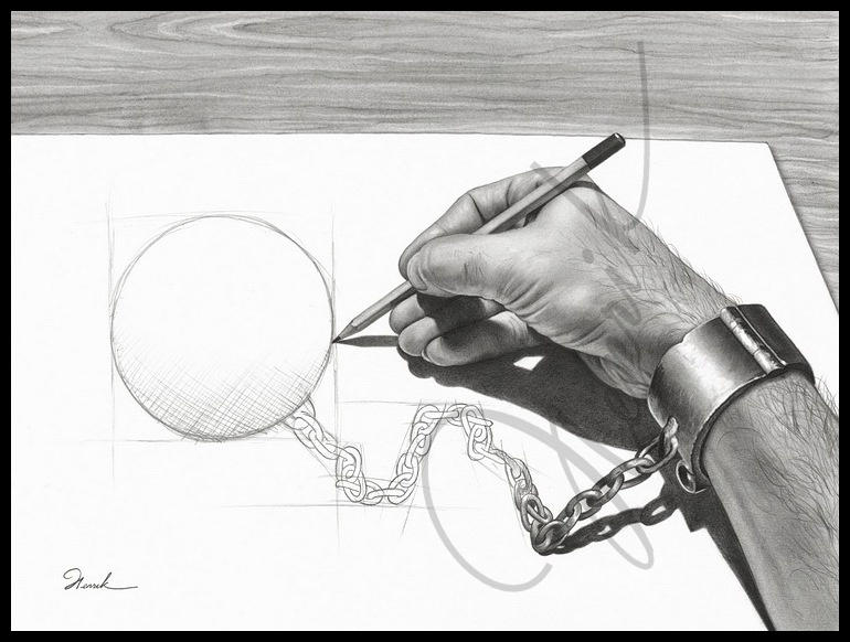 |
| Moses, Henrik, "Prisoner of my own". Graphite. 2006. |
This work is done by an Artist I had come across in Deviantart a few years back. As I saw Escher's Reptiles, I was inevitably reminded of this work. Both of them had shared the equally fascinating concept of illustrations and reality, and had successfully depicted them on paper. The overarching similarity is how the illustrations in both artworks shows how the illustration comes into life and how both elements are seemingly intertwined.
What would be different is that in 'Reptiles', the integration and disintegration goes both ways in a cycle, while in the 'Prisoner of my own', the transition only goes one way in terms of the transition between drawing and reality. However, there is an extra element of twist in 'Prisoner of my own' where the hand, which is the main subject matter whose chains are emerging from the drawings is the same hand that is used to draw the weight that would be imprisoning him. In a way, there is a different form of cycle present in 'Prisoner of my own'
Both works include such incredulous concepts that breaches between our mere visions and reality. Such surrealism can also be put to symbolism as done in 'Prisoner of my own'. Perhaps I could keep such a concept in mind for future inspirations!
Above is a video done by someone in correspondence to the work 'Reptiles' by MC Escher. Here, he/she had actually animated the entire process of the artwork becoming into reality. This way we could possibly see the motion version of what Escher had had in mind then. This will provide an interesting perspective to how we can further view this work and see it in motion. Labels: Blog Task
1 comments
Comment! (:


