Exhibitions - Liu Kang Exhibition at SAM
Saturday, August 27, 2011♥
11:14 AM
Liu Kang is a renowned SEA Artist and is part of the Nanyang Style. Also one of the Singapore pioneer Artists, he is a founding member of the Singapore Art Society.
SAM is having a gallery featuring most of his works, to commemorate 100 years since he was born.
And lucky us who had always been looking at his works via computer screens finally get to look at it as it really is!
These few works here are done in pastel, it has similar blending qualities to that of oil paint, in here, his works are still leaning towards a more realistic style, rather than the abstract quality of his later works. There is evidently a lot more detail and care put into the modelling of the forms such as the skirt patterns and creases of the clothing. However, rather it is clear that he mostly focused on the main subject matter - the humans, while other props are given less attention, and the background seems incomplete and fades back into the paper.
I espescially like how Liu Kang had handled the work below, he had captured the highlights and shadows on the face very well, in a very realistic lighting that is very much different from his later works. The highlights and shadows illustrate clearly the contours and angles of the face to portray the face's features effectively, bringing life into the portrait.
Looking at this work, we can see the artistic potential that Liu Kang has possessed early in his years as an artist. It is a different side of his artistic capability as what we've seen so far seems to be very much abstracted and stylised unlike the work here.
Above are some of the figurative pictures Liu Kang may have done as practice. Pastels were also used here. Through this we can see that he focuses on the basic body construction and figure drawings that would eventually build up to a foundation applied to his later works. Thus his later stylisation of the works did not come out of the blue rather, he learnt right proportions and forms before he simplified and stylised them.

This is a self potrait of Liu Kang himself. Again, we can see how he had used pastels to create the forms. Also, the base colour tone for his skin is actually the colour of the paper itself and not drawn on by any other medium. He then uses other tones and colours of pastels to define the forms and lines via the shadow and dark tones. This demonstrates his ability in using pastels. Furthermore I like how he uses warmer hues of colour tones that seemingly give life to his self potrait, the way he blends it into his skin gives it a warm glow and prevents the work from becoming overly dull due to the grey shadowings.

From here onwards, Liu Kang has progressed from pastel drawings to more bold and outgoing oil paintings. , here is an oil painting called 'Siesta', it is clear that he had done this work during or after his Bali trip along with other Nanyang Style Artists in 1952. This is clearly seen from the subject matter, a Balinese woman, as well as the scenery behind and the rattan chair. We can see some transfer of application here as the pastel figure drawings he had did prior to this would have provided him the foundation for such drawings.
Also, unlike his previous pastel drawings, he seems to pay much more attention to the blank space within the canvas, he had done the background in much more detail than that of the pastel works.
These are some preliminary sketches that Liu Kang had done in pastel, before going onto work on the oil paintings. We can see the planning in composition and posture, as well as the changes that had undergone in the work as he worked on the final piece.
'Artist and the Model' An iconic piece of artwork by Liu Kang depicting a fellow Nanyang Artist painting a Balinese model. We can see how different his style had changed in here as he only applied flat colours to the subject matters without any form of modelling. Also, we can see similarities with Gauguin in his use of bold white outlines, possibly inspired by that of batik patterns.
Here are some close ups of the image, despite the flatness of the colouring seen by afar, up close, we can see traces of his brushstrokes as well as its texture.

Here, the change in his style of depicting human form is even more evident from the almost featureless faces of his subject matter that had been greatly stylised.
We can also seem some form of influence from Cubism in this work as the forms are more edgy and geometric than his previous works. Solid blocks of colours had also been used to fill these geometrical shapes, bearing some similarity to that of Cubism
This work is different from the others, as he had used a palette knife to construct this work. It goes to show that Liu Kang had went beyond and experiment with different painting techniques in the course of his life as an artist. He had also included much more focus and interest towards the architechtural landscape of the life back then. This time, his focus on the human subject matter is significantly less than what we observe from his other works. We can see that his artwork here has more geometric shapes as suggested by the straight lines possibly formed by the palette knife. He also makes use of one-point perspective here.

Some chinese ink painting depicting Balinese women. This is work is interesting because a traditional Chinese medium, Chinese ink is actually used here to draw an unorthodox subject matter with contrasting cultures - the Balinese. These series of works provide an intriguing fusion of the different cultures via medium and subject matters which further demonstrate Liu Kang's liking for blending cultures.
Yet another iconic work is Life by the River. The work appears more dynamic in real life, rather than being seen from mere computer screens all the time. The bright and dynamic colours used in the painting seem to jump at you and capture your attention to the little details in the painting.
Furthermore, to further exemplify the little activities that are ongoing in the painting, Liu Kang made use of bolder darker outlines to define the basic shapes and forms of the subject matter to draw theviewer's attention to the subject matter.
This work here is one of his rare works that depicted a night scene. I failed to notice till now but, this secnery is exactly the same as the one in Life By the River, only since it's at night, there are no prescence of people.
If I'm not wrong, this was done directly on the base layer of the frame, so the frame and the work are one. Notice that the rim of the frame is more decorated and polished than his other works, you can directly compare with that of Life by the River.
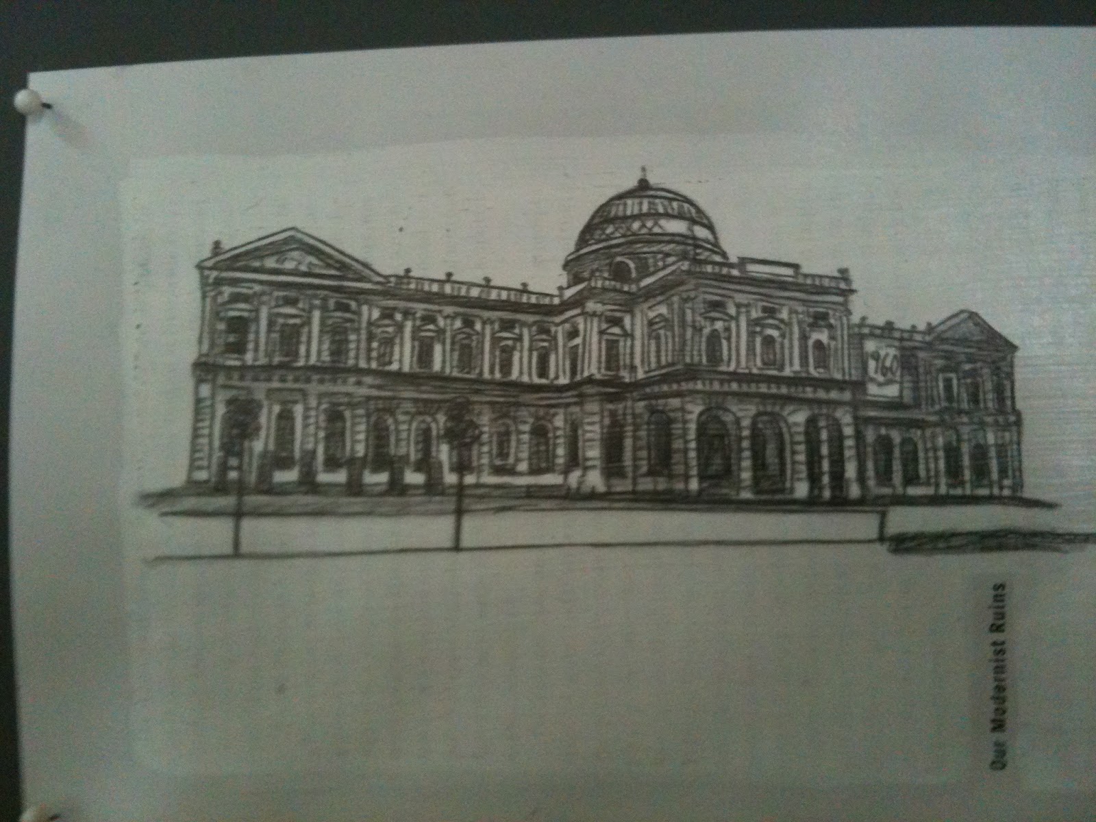
Below are some of his works, mostly based on architechture. These buildings are most probably from Singapore back then. We can see that
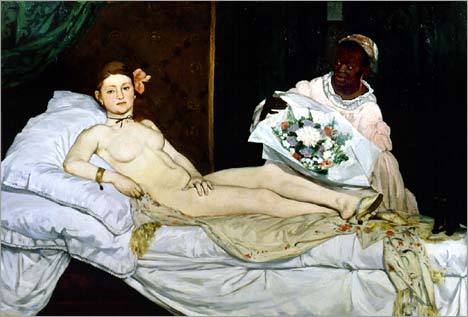
Don't you think the work above has adopted a more classical pose and composition such as that of Manet's Olympia, which too had been influenced by works of the great masters depicting Venus?
We can see that Liu Kang had done a work more pertaining to western classical poses in the Balinese context.It is intriguing how the influences from old masters could be passed down from artist to artist over generations. The fusion between east and west are clear here.
A painting depicting the Samsui women. Unlike the other paintings, Liu Kang had not stylied the facial expressions and the forms of the subject matter in this painting.
He had very carefully painted the women's faces, in great detail, inclusive of the creases and wrinkles that appear on their faces - revealing a greater depth of emotion, in this case, the fatigue of working so hard.
Even from the posture and of the subject matter, the way the hand grips the tool and works, we can see the exertion and work that the subject matter is actually doing.We can see the amount of effort the artist has put in in trying to express the feelings of the subject matter, and this illustrates the importance of body language and posture in expressing a message or emotion.
Another painting of the Samsui women, but without focus on the expression, but rather the landscape.
We can no longer clearly see the features of the Samsui women, however there is still enough body language and details for us to see what the Samsui women are doing, and in this case they are still working, but they look significantly less worn out than in the previous painting.
These two works below have significantly different qualities than the other works. For one, the colours are more desaturated and subdued, he had used duller tones instead of his usual vibrant colourations.
This is because these two paintings are a depiction of a real fire that took place, through the use of the dull colours, he had probably hoped to express the sorrow and despair of that mood.
The works below shows scenes and pastimes of the past Singapore, some still exist even today.
To end of, we went to a special corner where there were hats and other props, and role-played as a balinese and took pictures :D
Overall, I had a greater insight of Liu Kang's works and I am greatly impressed by the numerous amount of work he had done in his lifetime, as well as his undying dedication and passion towards art.
Labels: Exhibitions
0 comments
Comment! (:
Exhibitions - Singapore Bienalle 2011
Wednesday, August 24, 2011♥
8:07 PM
On this rainy day, we went to the Singapore Bienalle 2011, in this exhibition, we don't see any breathtaking, well modelled oil paintings or meticulously sculpted figures. Of the works we saw, there was more conceptual rather than focusing on the visual aesthetic quality , it was different from what I had expected but it gave me a new outlook on the concept of 'art'.
This artwork below exhibits the goods that are commonly found in activities of our daily lives and the concept is focused on that of a hardware store.
This artwork reminds me of the art movement - Dadaism, where artists also use ready-made items which are usually mass manufactured and claim it as his artwork. In this case the artist, Michael Lin has done something similar by using the many variations of manufactured items and placing it neatly side by side.
Below, this artwork takes up pretty much a whole room, and is made out of really Huge pillars of paper covering rolled up chicken wire. It resembles scaffolding and may also suggest a work-in-progress although it is a finished artwork.
Yes, these boxes do have rather nasty holes, but personally, I think those holes and cracks are actually artistic in the same sense as abstract paint splashes on canvas. They are accidental, you can never plan what cracks where and at the same time, it creates a unique texture.
It's like keeping the sea right under your desktop.
Even iPhones are instruments for art.
Hanging.. belts! It was only under close scrutiny that I realised those were actually belts and not random strips that hung from the ceiling.. The lighting has also cast shadows of the belts, creating interesting silhouettes of the belts.
Scribbles, they are art too. According to the guides, the artist had been there personally to draw whatever she saw outside on those very windows. It's a site-specific work as the work has a direct link and connection to the location itself and wouldn't be as significant anywhere else.
Very minimalistic blocks of colours.
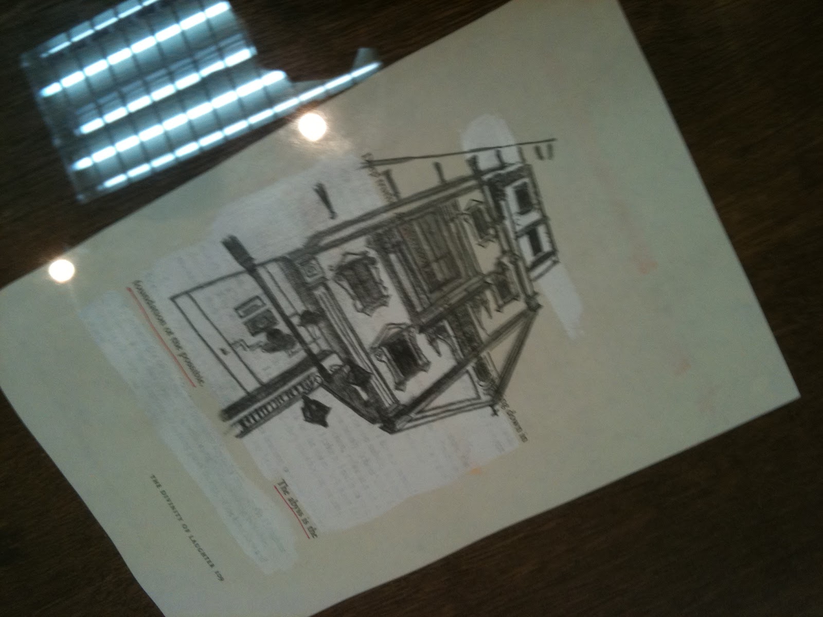
I like this artist. He has not only meticulously handdrawn all these buildings/houses, but it has a story behind it too. It seems like he has a phobia of entering buildings, and so everytime before he entered an unfamiliar one, he had to draw it, in a way get to know it, before entering. Can you imagine drawing every single building you've been in so far?
Falling text, all sorts of words falling down, forming ambiguous shapes.
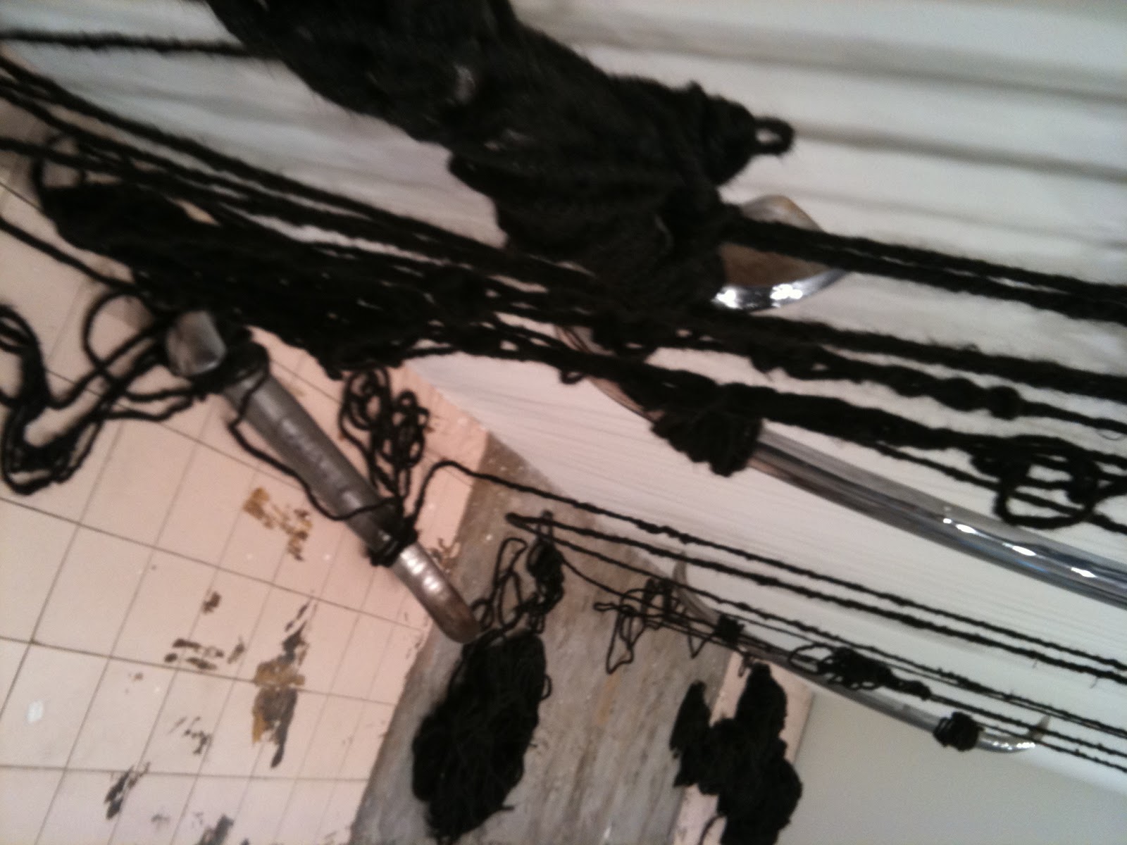
This is a hairy affair, cheesy, but really, those long ropes, braided and tied are indeed, human hair.
Those ropes of hair are then entangled and hung around the room.
Hair - Everyone has them (well, almost) yet in such a scenario, it really is extraordinary.
Specially like the piece below, it has a surreal quality to it - much like the movie Inception.
And it is entirely made out of cardboard!
Works by Students, this one here has an Odyssey of the Mind Trophy.. I know because I have them too..
Here is an installation, it's rather abstract, not quite sure what it's meant to represent, but it allows interaction in the way we can literally walk along the work..
Strings - Reminds us of the string game we play during primary school no?
Lovely scene outside the window, the old hangar of the Kallang Airport
Farmhouse.. A life-size model of a barn, with hay and all, even has animals inside.. it's not only visual, you can literally smell the hay too.
Something more simplistic, exploring simplified silhouettes of objects as well as bubble texts.
Labels: Exhibitions
0 comments
Comment! (:


 Here, the change in his style of depicting human form is even more evident from the almost featureless faces of his subject matter that had been greatly stylised.


 u
u