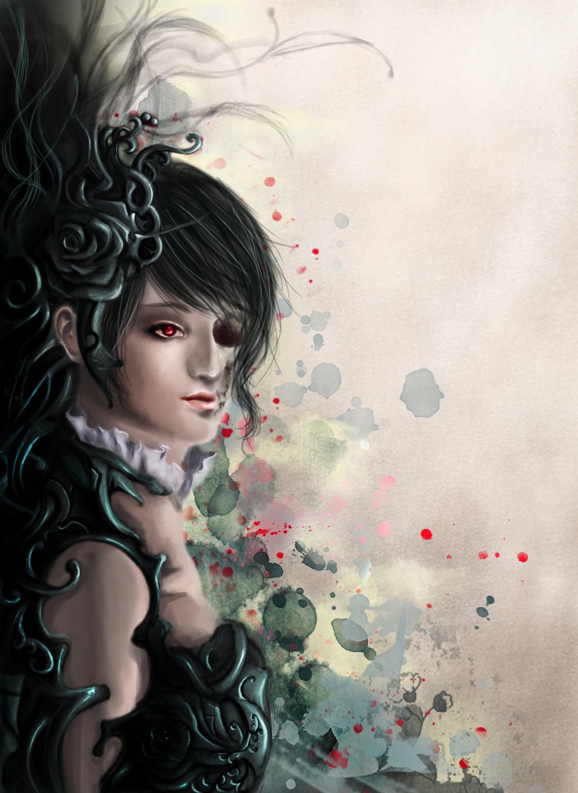
Amalgamate, 2012, Pencil on paper edited with Photoshop CS6
Part of my steampunk series, I went ahead to create this, using more intricate details. Also, instead of defining out the 'biological' and 'mechanical' parts, I sought to fuse them more in this work, hence the title - Amalgamate.
Using pencil to line out the details and some shadings, I had to use Photoshop to edit it before I could upload it online. Like I would do to a digital painting, I highlighted the lighted areas of the face and darkened my line art. The background was white but I darkened it using Photoshop to allow the subject matter to stand out more, while saving my lead.
In this work, my favourite parts is the steampunk flower formed by victorian embellishments, gears etc, as well as the use of the fan. Having made use of the fan in some of my previous works such as my Kimono, I thought it would be interesting to see it in a steampunk work. What surprised me was that after manipulating the edges of the fan to make it blend in with the mechanics, it did not look weird, in fact it was a nice touch to the composition amongst the many details that surround it.
2 comments
As part of the Sec 3 EOY Examinations, we had to choose amongst some themes to work upon. I chose disguise.
Having only painted in watercolour last year, I felt that I had lacked exposure towards oil painting.With some dabbling in digital painting, I felt that I had some experience with colouring, though not with the real thing. However I felt that I should take this chance to enrich myself and try something different.
My painting depicts a seemingly human figure all dressed up, applying make up. Why 'seemingly?' the peacock feathers at the tail that peak out signifies her supernatural non-human element, like a demon fox disguising as a human. Why do I not use a fox? I have attempted and tried, but I figured a peacock's tail is much more iconic and it implies pride.
Humans all have pride. Because of that pride, we dress up, put on make up, or other forms of psychological defenses and barriers to the extent of wearing a fake 'mask' when dealing with others. The subject matter here may be using make up, but it insinuates how people actually package and present themselves to others while masking the ugly sides of them. And that is the disguise.
Looking back at this painting one year later made me notice a few things - how inadequate my oil painting skills were. Working on it, it seemed to be the picture of my ideals. But right now, the flaws and areas for improvement are glaring.
Hopefully I'll have more oil painting opportunities in the future to better my skills.
For this work, it was done in conjuction with our SOVA syllabus last year on the Nanyang movement, focusing on the Liu Kang style in commemoration of his hundredth year.
Basically, we went through a series of his artworks and we were supposed to emulate his style and work from there.
Hence, in line with the Nanyang style subject matter, I chose the subject matter of a woman in Chinese opera costume. Since the Nanyang style focuses on the exotic and more cultural aspects of the local flavour in Singapore, I decided to do this as I recalled having seen Chinese Operas live in Singapore in some neighbourhood areas and it stuck to me. Nowadays we rarely see such occurrences. I figured while Liu Kang focused more on Bali, Indonesian cultures, I would go toward the Chinese culture.
I adopted a portrait as Liu Kang had featured portraits with rich cultural embellishments as well.
As most of the information are up on my boards already, I'll keep my description short and sweet.
Stemming from my own bloodline of an Indonesian mother and Chinese father, the work seeks to depict my cultural roots by juxtaposing symbolic elements of both heritages. It strikes a balance between two similar yet differing cultures that shapes my mindset and ideologies. In layering the surfaces, it expresses the depth of the lineage beneath the skin deep surface; how traces of my ancestry go beyond physical features inherited.
Such stunning effects of portraits is something which I had been striving to achieve in both traditional and digital media.
Each work is dynamic, the facial expressions and features are beautiful in each, yet they hold a form of individuality, expressing different emotions and feelings even with the eyes closed.
I have found myself trying to master drawing the most anatomically proportionate and aesthetically appealing face over the years of my art making. Yet, perhaps I have failed to realise how beauty can come in different forms and it is in such variations that make the features more realistic, and even more breathtaking.
I personally think that this artist's share of works bear some resemblance to my own, as I also like to embed fashion into portraiture. Also, I adore the way the artist had treated the paint, especially on the faces in terms of modelling the forms and applying the shadows and highlights. Clearly, there is still much for me to learn as an artist in terms of technique.
I will admit, I didn't draw this with the skull and morbidity in mind. It started off as a normal boy, but I had this sudden inspiration to inject in this idea. After all, I felt that a different twist to my artworks would do no harm, rather the concept had made it more interesting and dynamic than usual.
What makes this work different from my others is that this has probably the most detailed background I have worked on. On my others works, I have a great tendency to simply focus on the subject matter instead of the background afterwards. I had initially intended to do the same with this, however with a few tries it seemed to turn out better than expected and so I had retained it.
I very much like how the cool colors work against the warm red and yellow in the work and how the disintegration of the subject matter is in line with the direction of the clouds.
The disintegration and the revealing of the bones under the skin also show how youth or beauty is merely skin deep, eventually it'd all fade away, and what's under is merely white solid bones.
After a long break of having a lack of inspiration to draw or digital paint anything, someone who had been viewing my display of works on my Facebook page had suddenly expressed interest in having me paint something for him! Delighted by how I had been recognized and presented a opportunity to showcase my work, I took on the commission and did this work.
He did not restrict much but he mentioned about liking the splattered effects from my Geisha work and some of my steampunk related works. Hence in this work I tried to link them up together.
I wanted to create a work such that the subject matter is seemingly connected and joint to the side with dark tendrils creeping and consuming her gradually. At the top, I used a normal brush from photoshop ti create a smoky, inky effect which the 'darkness' dissipated from to make the top look a little heavier to balance the composition.
Being largely dull and cool, the image lacked warm colors which I used as an chance for me to use the speck of red in her eyes as a focal point. The process of drawing the face was not as easy as I had expected. After attempting to draw it by myself a few times, it always tended to look wrong, not worthy of being there. What's more, as a commission, I was more determined to achieve perfection. Hence I sought to look for photographic references which had helped greatly in the forms of the face. It turns out that we sometimes have to stop and look for references instead of stubbornly going ahead blindly.
Overall, I was highly satisfied with this painting and I will print it out soon in A3 and pass it to him.
My comment of Ashley's is as shown below as there were a few technical errors:
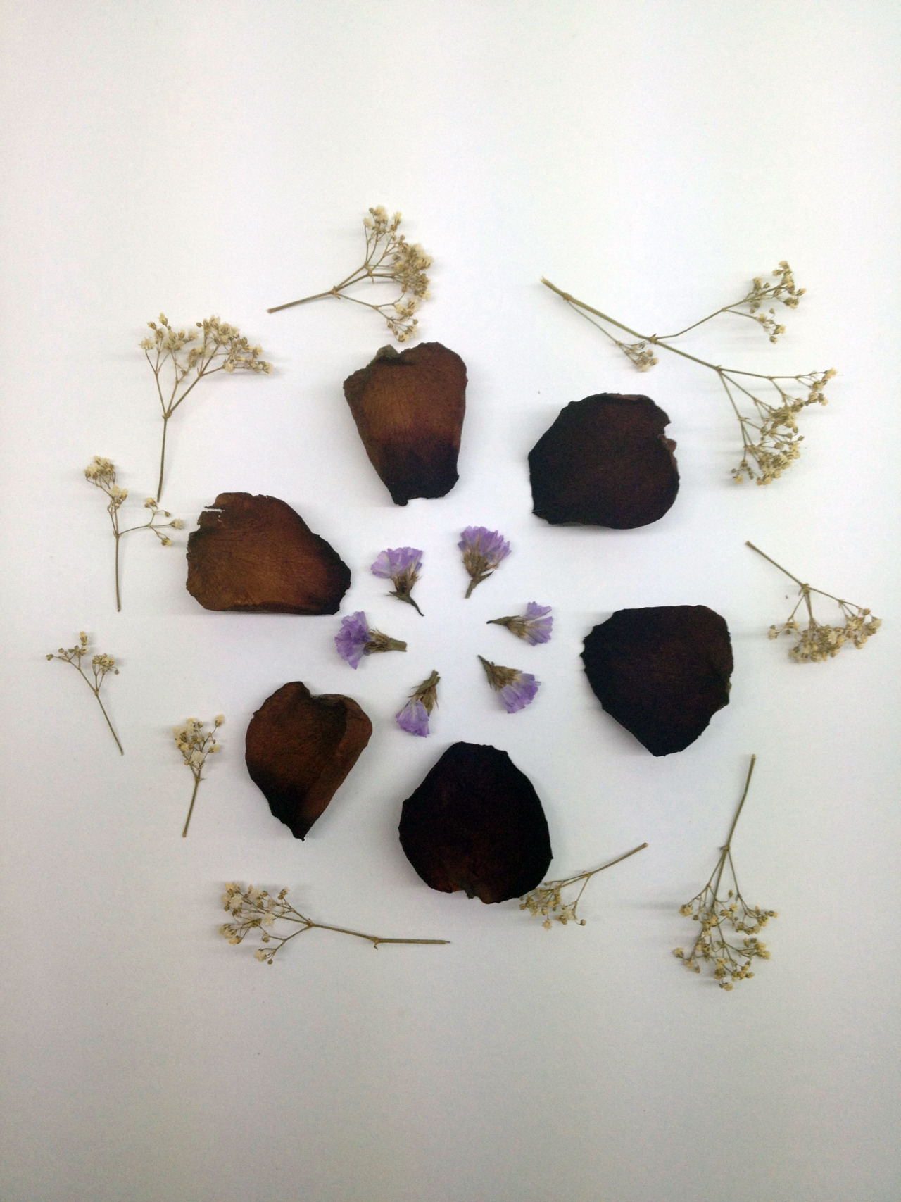
this is part two of my andy goldsworthy task which is long overdue, but still. this is me, stepping into andy's shoes and trying to imitate him in his 'environmental sculpturing' (as some of his critics call it), and create something new. i tried, twice, because i didn't really like the first one. so this is the second one i came up with, inspired by nature itself. my composition isn't a sculpture per say, despite its three dimensionality, because it doesnt really stand up on its own, however, i'd think of it as a flat representation of a deconstructed flower.
i imitated andy's style of using the the elements from nature- i used petals of a rose and small stalks of flowers, and assembled the composition with my bare hands. the dark purple rose petals and arranged in a circle surrounding the tiny lavender flowers in the middle. this is me trying to mimic andy's pebbles artwork (the circular motion). and surrounding that are little white stalks of flowers to frame the artwork.
to understand the rationale behind this piece, you must first know that the flowers i used are all dried up, so technically they are dead. so while andy tries to capture the transitory moment of nature at its peak of its beauty, i try to find the beauty after the life of nature burns out. this might seem ambitious, or idealistic (as some may say death is not one to be admired), but i think that beauty is only in the matter of perspective. hence, here i try to recreate what the flowers once were, by tearing them apart only to assemble them to what they were before, just in a simpler form, in the hopes of preserving their moment of beauty in their afterlife.
A continuation to my Steam Punk Series. I wanted to create one which has a frontal profile. While I find that the face and embellishments on the first one seemed much better, I think that the body area of this work looks more defined than that of the previous one as there is a greater consideration of the concept. Right at the center there is this angularly shaped container which represents the heart, with some sort of liquid of fuel inside. Around it, are the gears interlocking together working together in a system which is rather similar to how our biological bodies may work.
Also, I incorporated a flower, a rose into the composition of the headpiece of the character. I thought it was provided a different twist and element to that of the image. Being in pencil, it is not very clear to the viewer whether the flower is a real flower or one that is made of brass. Personally, I feel that it works both ways but I ought to put in an effort to have a clear stand to illustrate the flower in the preferred way such that it is clear even in a monotonous image.
Discovering this theme known as Steam Punk is probably one of the greatest things I have discovered in the course of my artistic journey. Being interested in the Victorian era style of floral motifs and fashion, it had a great impact on my subject matter for awhile. Yet, it had gotten old. Steampunk brings in a sense of detail and intricacy which felt like something that had been missing all the while.
Being very attracted to the high level of details demanded by this theme, I attempted at a work which featured a side profile of a woman with gears and other steampunk elements to make up her shape.
The gears, keys and wings were great to play around with to create a nice composition, but I did have to juggle between the highly intricate parts and the more simple elements to create the variation I was going for.
This also allowed me the opportunity to incorporate detailed drawings of accessories and elements into portraits.
Just this week, I participated in the National Junior Robotics Competition. Contrary to what people would think of in a Robotics competition, it has several aspects such as Booth Design, Entrepreneurship, etc.. Hence, I could utilise my aesthetics ability to contribute in these segments of the composition.
Seeking reference from my senior's design from last year, it seems as if they tied in really closely with the theme which was domestic robots. Hence, with the robolyimpics theme this year, I tied in the robotics elements with the olympic elements. One part that shows this unity the most is the Olympic symbol made using gears. Given the interconnective nature of the gears, it ties in with the encircling of the five olympic rings in forming the logo.
As the main body of the robot, I adopted the idea of using a basketball scoreboard, putting our group name, 'Huh?" in the screen of the board, along with the year. Extending from the main body of the robot is six robotic arms performing the six sports from the olympics which our robot was tasked to do in the mission provided for our category, boxing, weight-lifting, fencing, basketball, judo and cycling. Hence it also ties in with the competition.
While not clearly visible, the orange strips on the two sides are actually running tracks made out of orange paper then delineated with maskng tape to create the track lines for the effect. Around the remaining empty spaces, we placed different lego heads with varying expressions all around as well as question marks '?' which shows our group name.
Overall, we were quite satisfied by the result of our efforts in creating this booth design!
This Japanese artist had adopted a unique way of painting with the complicated process of resin combined with painting. He had invested a large amount of time into his fish painting prior to adopting such a technique which shows the amount of effort and preparation to achieve such a level. It greatly inspires me how he has used such an unconventional approach to painting to bring his paintings into a new dimension - 3D as opposed to the usual paintings on a 2D surface.
I think what is most fascinating about his work is how one would not think that the artwork was created by painting at first sight. It would look more like a sculpture. The use of the resin and the layers of paint he did is a highly innovative method with amazing results.
What we can learn from him is how he ventured to experiment for a whole new approach to painting in such a unique methodology. In a way, he has opened a whole new possibility in this aspect. Other than gold fishes, other subject matter could also be painted and made to look like 3D objects suspended in resin.
From this, I think I can try to explore new means and ways to incorporate painting into 3D art in such a manner.
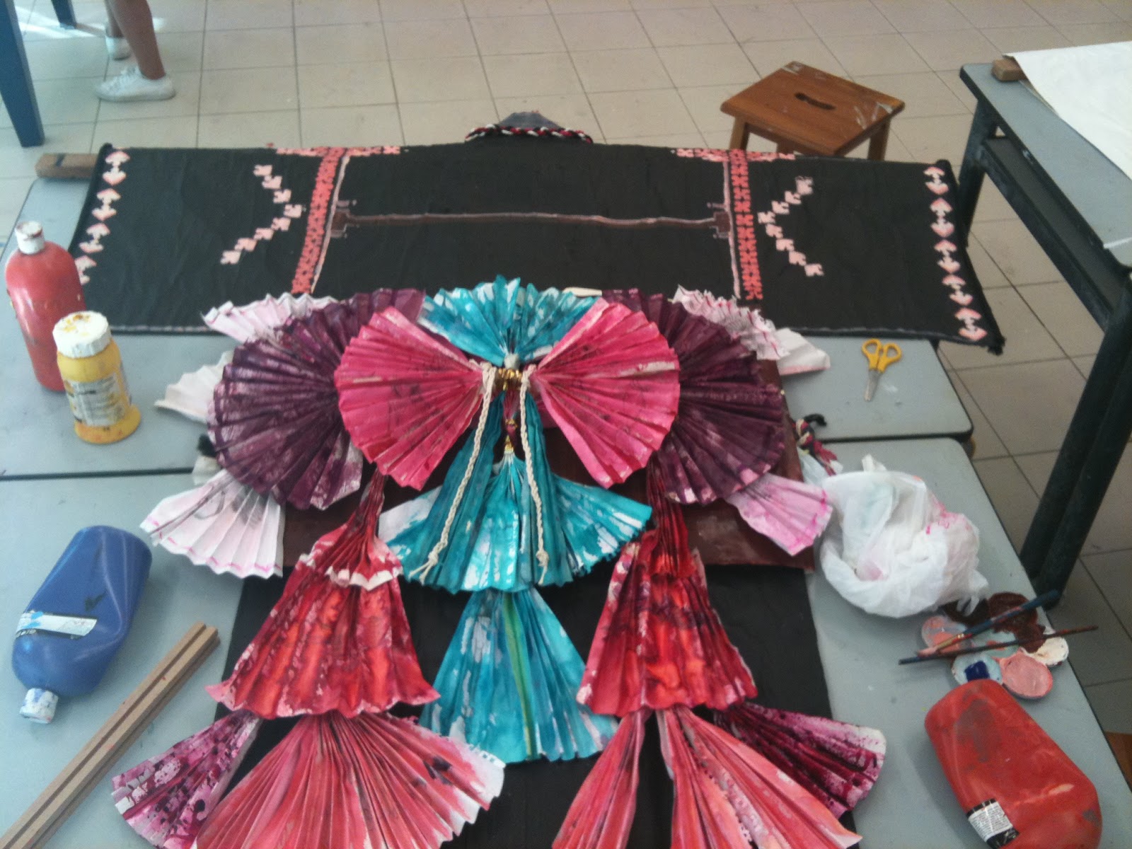
This post is largely overdue as this assignment was completed a year ago...
The Kimono itself is probably non-existent anymore, at this point I am thankful for all the photos I took.
This is some stamps on the Kimono which I made through a few wooden blocks I purchased from Daiso and stamping it in some paint before applying it on my Kimono. It was difficult to get all the paint on the block and leave a neat print, but the grungy effect was unexpectedly welcomed as well.
For this part of my kimono, I bought white rope and then get some black rope from Jubilee. I dyed some of the white rope to reddish pink as shown in the picture. Although the ropes were already textured, I thought it'd create a more intricate effect when I braid them all together in contrasting colours, it looked well against the Kimono and fit in nicely.
A concept I adopted here for my Kimono is fans. It has a wonderful 3 dimensional effect and it is simple to create. To make up for its simplicity in methodology, I came up with a fan pattern and folded the fans accordingly to fit in. The layering of the many fans put together created an all new effect and it was even better after I inked them. To colour the fans, I put diluted ink into the spray and sprayed them all over the completed fans to create a splattered and gradient effect on the fans. However I think it was too watery and it made the fans kind of flimsy. Luckily, it was better after it dried.
Amid browsing deviantart each time, this one digital artist seemingly stands out.
She is a 21-year old Canadian artist who goes by the username of *sakimichan.
The following two are simply her sketching practices.
River Spirit, 2012, Photoshop CS4
Gold Fish, 2012, Photoshop CS4
Hello Friend, 2012, Photoshop CS4
What really strikes me in her works is not just the accuracy, pictorial representation of the subject matter, though it is crucial. On scrutiny, we can still see the visible brushstrokes that look raw, yet smooth with colour. It is absolutely amazing how she does her digital paintings in such a style. Also, all her paintings has an individual style and atmosphere to it. In each, the lighting is different, even the expression the subject matter varies accordingly evoking enough emotion to allow the viewers to sense and understanding. In this aspect I still have much to learn from her as my illustrations do not often show emotion, and the background atmosphere seems dull and undeveloped as contrasting with this young artist here.
A series of Fashion Designs I did when I was in Secondary 2, some of which had been displayed in the art gallery before when we did a mini exhibition project.
This series was drawn on paper with pen and markers, scanned and edited with Photoshop.
During that time, I was immensely into the art of fashion, especially couture. The bolder, the more extravagant, the better. While my choice of colours were largely limited by the number of markers I had, the bold colours provided an extra edge to my designs. Back then, my drawing style was highly stylised as seen below with the elongated limbs and representational figures. Many of my friends had critiqued it as unreal, too skinny, but I was stubbornly insisted on it. Looking back, this stylisation, while unreal and 'too skinny', had to a certain extent, added to the charm of my past works.
Artwork - Odyssey of the Mind 'The Egoists' T-Shirt Design
♥
7:13 PM
This series of T-shirts are made for my Odyssey of the Mind (OM) Team along with our coaches. It was referenced from Alice in Wonderland of which we had adopted for our Long Term Problem.
Despite the hours of conceptualisation and designing, the shirt was never made as there was some pricing issues.. This was designed somewhere last year.
For each character design, I sought to encapsulate the unique qualities of each character, with references to both the original fairy tale as well as our very own OM representation of it.
The colour of the shirt (hot pink) is meant to create a bold statement.